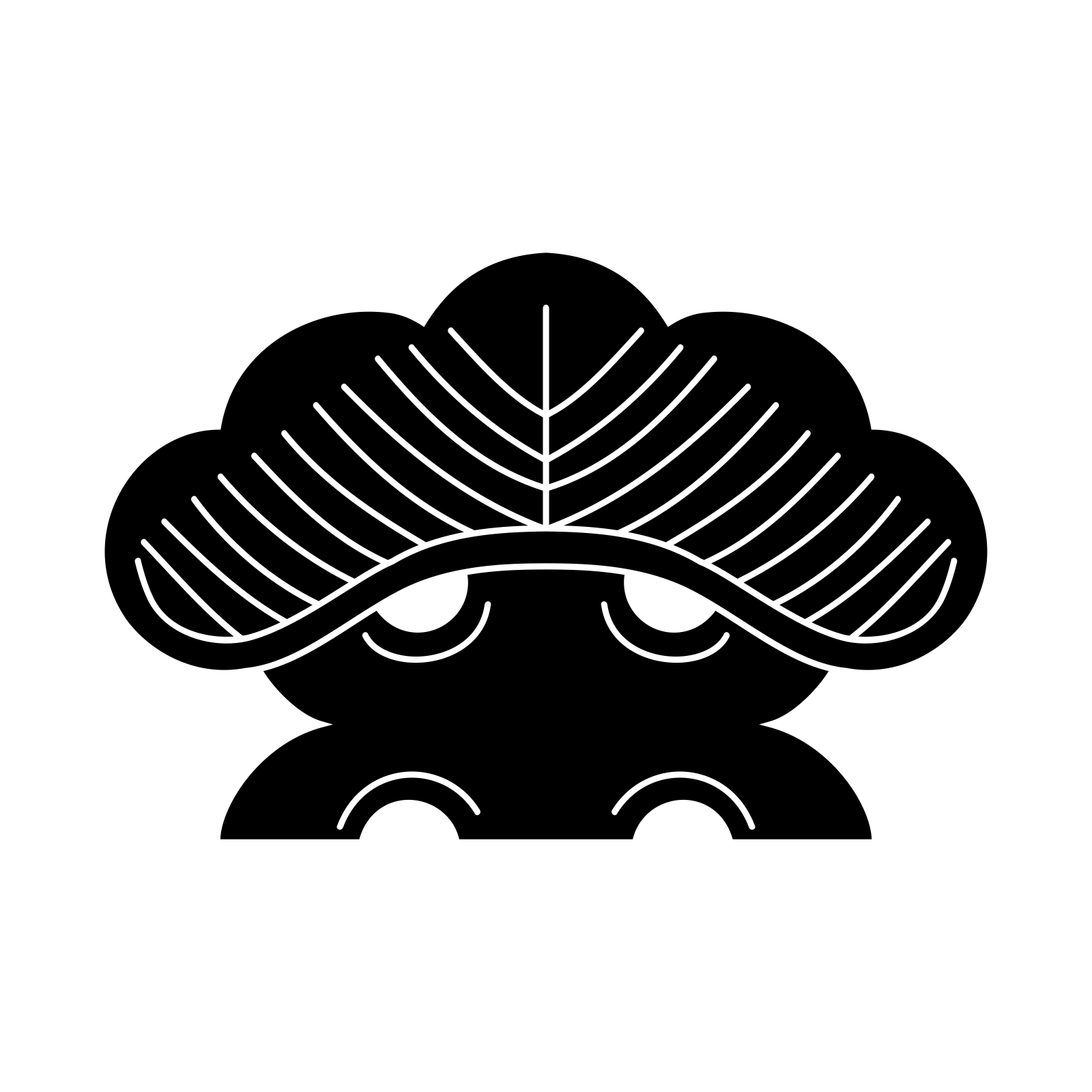
"Hitotsu Matsu" (a single pine), a traditional Japanese family crest. Illustration by Mukai, CC BY-SA 3.0, via Wikimedia Commons — Source. Colors inverted from the original for print-style presentation.

At the gate of the Heian imperial palace, a courtier's ox-drawn carriage — a gissha (牛車, an ox-drawn carriage used by Heian nobility) — had to be identified before it reached the entrance. Etiquette on the road required it: a lower-ranked carriage gave way to a higher one, and the pattern painted on its side supplied the information that decided who yielded to whom.
That painted pattern is the ancestor of the kamon (家紋, a Japanese family crest): a design system that has stayed legible for roughly a thousand years of continuous use, long enough to make most corporate logos look new.
Every era picked the pattern up again
Japan's Cabinet Office public magazine, Highlighting Japan, dates the practice to the "latter part of the Heian period," when a competitive court culture pushed noble households to devise ever more distinctive patterns for their carriages. What happened after that is the part that matters for a claim about age: the patterns did not stay confined to carriages, and they did not go out of fashion. Samurai clans adopted them in the Kamakura period to mark banners and armor, so allies could be told from enemies in the chaos of a battlefield. By the Edo period, merchants and townspeople who were forbidden surnames took up crests of their own, using a kamon to do the identifying work a family name would otherwise do. When the Meiji government required every citizen to register a surname in 1875, crests did not disappear — they carried on alongside the new names, still marking kimono, still marking gravestones, into the present day. Each era chose the same visual logic again on its own terms, which is a harder thing for a design to achieve than simply surviving behind glass in a museum case.
Strip the color and the shape still has to work
A kamon stays legible across thirty feet of muddy road, or thirty feet of a modern conference room, because of a discipline applied to the drawing itself, regardless of motif. It is drawn in a single color, almost always a black silhouette resolved against a plain ground, or the reverse. Color is not treated as part of the design at all: the same crest can appear in red thread on a battle flag and black ink on a kimono, because identity lives entirely in the shape. That shape is built from a narrow vocabulary — circles, straight lines, a small number of curves — composed so the whole design reads as one closed silhouette rather than a scatter of details. A pine-needle cluster, a wisteria spray, a hawk's feather: whatever the motif, it is simplified until it can be taken in at a glance, at a distance, in poor light, on a moving battlefield or a moving carriage.
That is, without alteration, the brief a modern identity designer is handed: reduce to one mark, make it legible small and legible large, make it recognizable in silhouette before any detail resolves. A kamon met that brief centuries before the word "logo" existed, using a woodblock, a stencil, and a needle rather than a screen. The test survives the jump to any era: strip a mark of color and shrink it until the detail disappears — if the shape still reads, the design will last.
The clearest documented case of the habit carrying forward is Mitsubishi. When Yataro Iwasaki founded the company in the 1870s, he combined the three-leaf crest of the Tosa domain, his first employer, with the three-stacked-rhombus crest of his own Iwasaki family. The result — three diamonds meeting at a center point — has served as one of the most recognized corporate marks in the world ever since, a direct line from a feudal household crest to a global logo, carried by the same habits: one shape, no dependence on color, legible at any size.
One mark held a whole household's story
A kamon is also a compressed story, which is what separates it from a purely abstract logo. The motif chosen — a plant, an animal, a tool, a celestial shape — usually points to something the household wanted remembered about itself: an ancestor's occupation, an auspicious plant tied to the family's fortunes, a battle honor, sometimes a pun on the family name. Highlighting Japan puts the number of individually catalogued crests at more than 30,000 once minor variations are counted; other tallies commonly cited put the number of distinct designs in active use closer to 20,000–25,000. That scale only makes sense once each crest is understood as a household's attempt to say something specific about itself in a single mark, rather than a decorative motif picked at random.
That density of meaning inside a simple shape is a large part of why a kamon survived the arrival of the modern surname. A name tells you which family. A crest, in one glance, tells you something about who that family understood itself to be. The habit of compressing a story into one mark did not end with the Meiji reforms — in some households it simply moved from the family register to a factory gate and a company seal, and from there into the vocabulary of Japanese branding at large.
The crest still does the job it always did
Most kamon today live a quieter life than a boardroom. The clearest surviving use is the montsuki (紋付, a formal kimono bearing one or more family crests), worn at weddings, funerals, and Japan's most formal ceremonial occasions — a garment whose degree of formality is measured by how many crests it carries, from one on the back for the least formal version up to five for the most solemn. A crest also still marks a family gravestone, and a stylized version of a kamon often appears on the noren (暖簾, a fabric divider hung at a shop entrance) of long-established restaurants and inns, doing the same original job: telling a passerby, at a glance, whose house this is.
A bonsai carries a comparable idea, on a smaller and more private scale. As discussed in "Why Does a Bonsai Have a Name?," a tree that has passed through enough hands and enough decades is eventually given a mei (銘, a bestowed name) — not a label for inventory, but a name that compresses the tree's own particular history into a single word, the way a kamon compresses a household's history into a single mark. Neither a crest nor a mei is decoration added at the end. Both are the point where a long, specific history turns into something recognized in an instant — the same habit of Japanese design, running from a Heian carriage door to a centuries-old pine, largely unbroken and still in use.
References
- Highlighting Japan, Cabinet Office, Government of Japan — "Kamon, Japanese Family Crests, Their History and Features" (December 2022) — Heian-period origins on ox-drawn carriages, adoption by samurai and Edo-era townspeople, the 1875 surname decree, and the estimate of more than 30,000 catalogued crests.
- Nippon.com — "'Kamon': Japan's Family Crests" — overview of kamon history from the Heian aristocracy through samurai, merchant, and commoner adoption, with an estimate of 20,000–25,000 crests in use today and the five most common motif categories.
- Wikipedia — "Mon (emblem)" — design conventions of mon as fundamentally monochrome marks, their geometric construction, and the documented descent of the Mitsubishi three-diamond logo from the Iwasaki family crest and the Tosa clan emblem.
- Mitsubishi Electric — "More about the Logo" — Mitsubishi's official account of Yataro Iwasaki combining the Tosa clan's three-leaf crest with the Iwasaki family's three-diamond crest to create the company's mark.